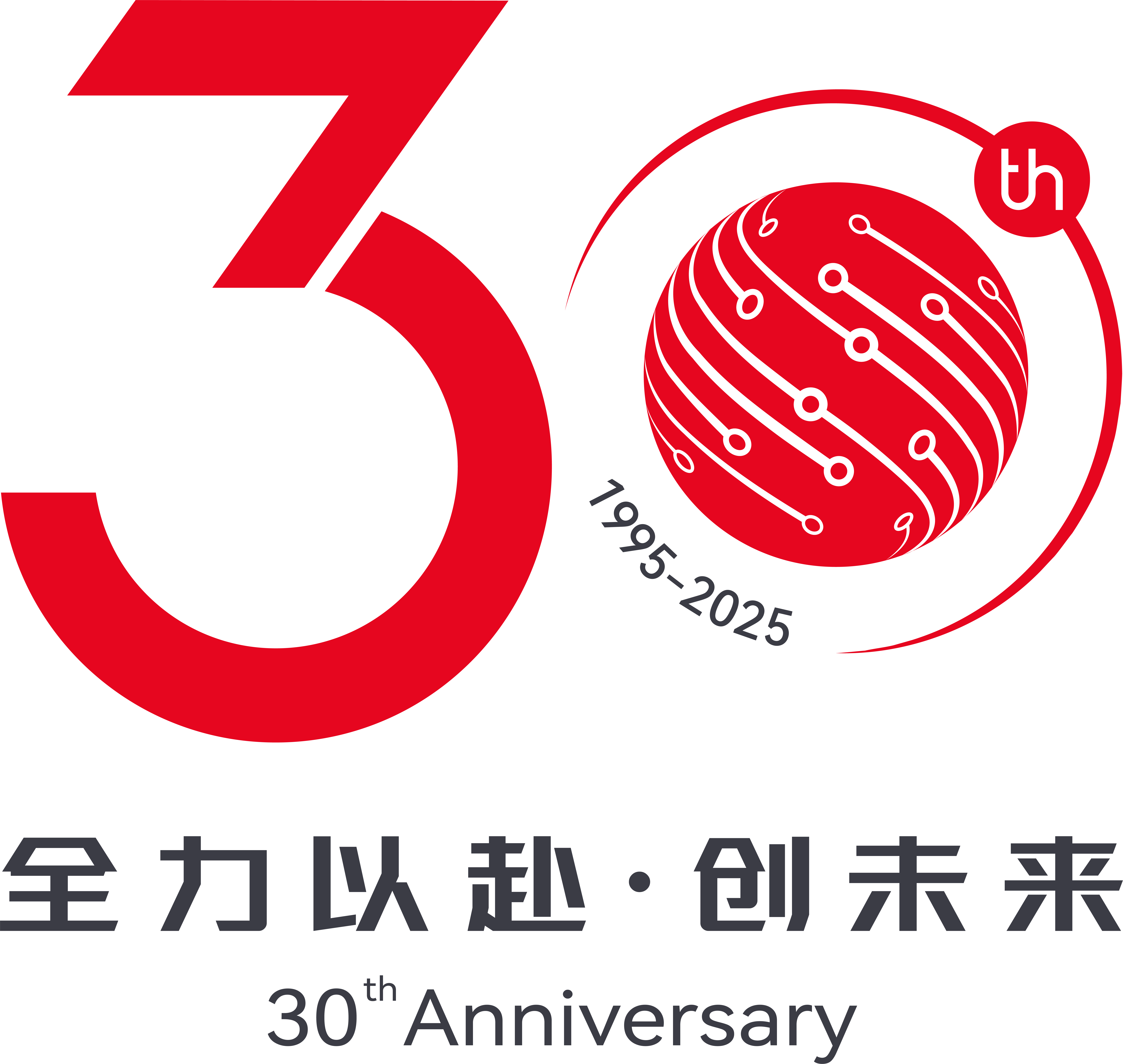
From 1995 to 2025, over 30 years of ups and downs, Click has never stopped moving forward, carving its own growth path in the tide of the times. Today, standing at the new starting point of the 30th anniversary, we officially release the exclusive logo for the 30th anniversary celebration activities. With design as a pen, we write the prologue for the next 30 years!

The logo takes the number "30" as the core anchor, integrating the corporate brand DNA into the design. The cosmic orbits outline the service boundaries, and the circuit elements weave the technical context, implying that Click has always been expanding the service dimensions outward and focusing on in-depth development in the industry. Dripping energy converges to create infinite value with limited resources; digitalization and intelligence work in synergy to pave a path for sustainable development.
.png)
With a global perspective in layout and deep roots in the field of innovation, the "Vision Red" in the LOGO represents both inheritance and new life: it continues the profound accumulation of 30 years of manufacturing and services, and unleashes the strong momentum for future development. This shade of red connects the past and the future, witnesses the original aspiration of "going all out and never slacking off" in services, and anchors the forward direction of "taking quality as the foundation and innovation as the oar".

Like the constant brightness of the moon and the rising of the sun, all Click employees will join hands, forge ahead with determination, and go all out for the next shining 30 years!